Demystifying Enterprise Analytics
A Component-Driven Framework for High-Density Holding Company Dashboards engineered to bridge the gap between complex multi-billion dollar portfolio numbers and instant boardroom intelligence.
Executive Summary
Holding companies manage diverse, multi-billion dollar portfolios spanning disparate industries—from traditional asset management to cutting-edge tech ventures. For the C-suite and high-level managers, "dashboard fatigue" and fragmented data sources create critical bottlenecks in strategic decision-making.
This project details the complete UX overhaul of an enterprise performance ecosystem. By implementing a unified, modular visual framework tailored to the technical constraints of PowerBI and Tableau, we transformed complex, siloed operational numbers into clean, scannable, high-impact intelligence interfaces.
Accelerated Alignment
Slashed client approval timelines by visualizing data structures early, eliminating the costly cycle of re-engineering complex layouts natively inside PowerBI and Tableau container models.
Increased Engagement
Achieved a 20% to 30% surge in platform adoption among notoriously time-starved C-suite executives and managers through unified layout semantics.
Improved Accuracy
Reduced data interpretation errors through standardized semantic visual styling, consistent labels, and explicit performance-to-target threshold boundaries.
The Legacy Overhaul: From Cognitive Fatigue to Clarity
Enterprise performance reporting previously relied on fragmented spreadsheets and disjointed analytics setups. We transformed these archaic practices into a synchronized, performance-oriented intelligence center.
Legacy State: Clutter & Bottlenecks
- •"Dashboard Fatigue": Disjointed tables packed with raw, un-prioritized numbers without central scannability.
- •Fragmented Data Sources: Asset managers and executives forced to manually align multi-currency operational sheets.
- •3-Day Approval Loops: Building complex layouts directly inside PowerBI without blueprints led to costly re-engineering cycles.
Unified Performance Ecosystem
- •3-Tier Progressive Disclosure: instant scannability for C-Suite with immediate detail drilldowns for operators.
- •Dual-Theme Token Architectures: Perfect lighting adjustments from dark monitoring hubs to bright boardroom boardrooms.
- •Synchronized Scanning Matrices: Instantly diagnose conversion friction and compare verticals at a glance.
User Personas: Strategic Macro vs. Granular Micro
Holding companies involve diverse stakeholders with conflicting needs. We architected the interactive layouts to cater directly to two highly distinct corporate user profiles.
The Time-Starved Strategic Director
Needs to identify overall corporate health, target variance margins, and strategic converting baselines in under 10 seconds. Requires minimalist layouts that prevent cognitive fatigue during multi-billion dollar board meetings.
The High-Density Data Auditor
Needs to drill down to specific performance variances, review regional target details, and ensure absolute compliance parameters for strategic audits. Requires high-density tabular data grids.
The 3-Tier Progressive Disclosure Model
Compare the interactive React design sandbox with the actual high-fidelity enterprise production dashboards deployed inside the holding ecosystem.
Tier 1: Macro Scorecard View
Holding Co. Progressive Disclosure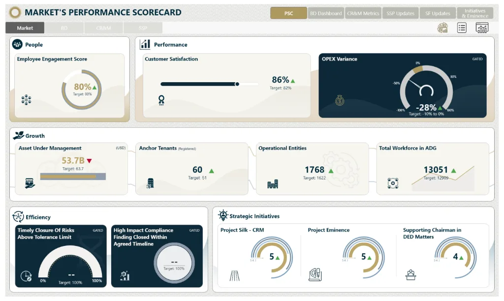
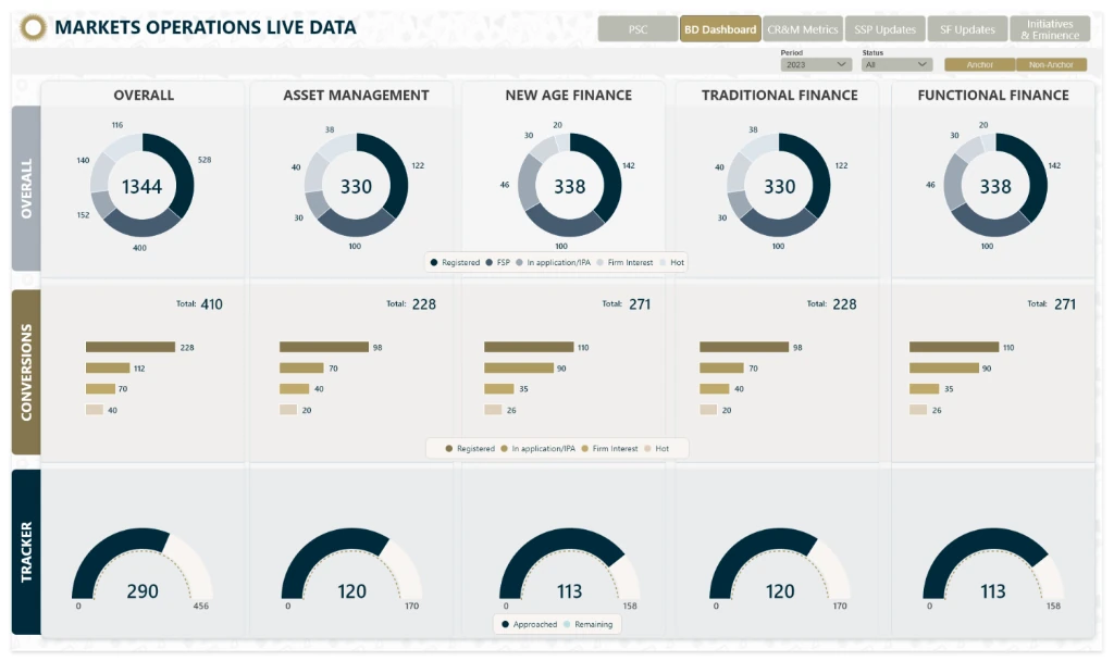
Cross-Vertical Synchronization Matrix
In Markets Operations Live Data, we designed a highly advanced matrix grid. By intersecting core portfolio sectors against conversion streams, executives can scan horizontally to compare divisions, or vertically to diagnose bottlenecks instantly.
Dual-Theme Token System & Production Dark Mode
Holding company operations require visual layouts that perform flawlessly across multiple lighting levels—ranging from low-light operational monitoring hubs to bright executive boardrooms. By mapping semantic parity tokens across both themes, we structured a unified layout blueprint that adapts dynamically.
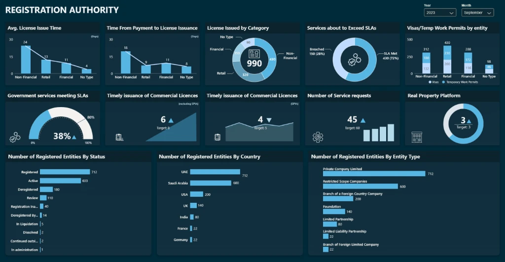
Registration Authority Dashboard
Designed for heavy-duty analytics environments. Utilizing a deep slate aesthetic coupled with high-impact glowing neon indicators to prevent eye strain during long analytical deep-dives.
Boardroom Presentation Ready
Designed for board presentations and strategic client deliveries. Featuring clean, sophisticated slate-gray lines, crisp text boundaries, and a paper-clean white background designed for peak readability under office lighting.
Overcoming Technical Constraints & Container Models in PowerBI/Tableau
Designing custom components for business intelligence tools like PowerBI and Tableau requires a deep understanding of their strict technical ecosystems. In early testing, developers reported that standard custom designs frequently failed during ingestion because the container layout grids inside PowerBI do not support dynamic responsive scaling or custom CSS margins natively.
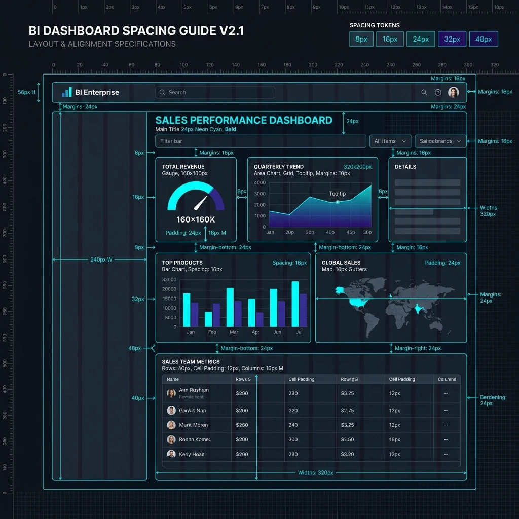
Rather than forcing developers into a tedious, costly cycle of trial-and-error custom coding inside BI environments, we engineered a complete Pixel-Perfect Component Blueprint System mapped directly to the native container models of these applications. By defining rigid, 8px grid-aligned design tokens that match Tableau's native floating layout parameters, we eliminated delivery bottlenecks entirely. Cards, charts, gauges, and tables were delivered as modular templates, slashing overall engineering implementation cycles and avoiding technical debt.
Dashboard & Data Table UX Rules
Drawing inspiration from industry-leading UX patterns from research by Pencil & Paper, we compiled a strict design playbook. These standards ensure that density never compromises clarity, especially in high-stakes B2B financial products.
B2B Density over Simplification
Unlike consumer mobile fintech that abstracts complexity away, enterprise super-users require information density and customizable layouts (similar to the Bloomberg Terminal). Our framework allows executives to view vast datasets simultaneously to facilitate high-stakes, fast-paced decision making.
Multi-Dimensional Time Tracking
Fintech dashboards must balance historical trends spanning decades alongside real-time updates down to the millisecond. By engineering multi-layered visualizations, we enabled analysts to track long-term baselines while monitoring high-frequency deviations in unified viewport containers.
Precise Tabular Scannability Rules
We enforced a strict visual scanning standard for all enterprise grids:
- Left-Align Strings: Text labels and alpha identifiers are left-aligned, matching Western reading mechanics.
- Right-Align Numbers: Numeric assets, rates, and values are right-aligned to permit instant vertical digit-count comparisons.
- Header Synchronization: Column heads align exactly with their cell values to reduce visual alignment friction.
Data Mapping: Eliminating "Gotchas"
Unexpected visual edge cases—such as massive volume differences, currency conversions, or missing telemetry metadata—frequently break standard layout grids. By conducting rigorous Data Mapping Workshops, we identified dataset discrepancies and built robust UI safety bounds into our core design system upfront.
Targeting Dashboard Archetypes & Onboarding Anatomy
Drawing from Pencil & Paper's UX pattern taxonomy, we structured our holding company analytics around specific Dashboard Archetypes and meticulous Anatomy onboarding controls to eliminate cognitive waste.
Narrative Historical Synthesis
A storytelling ecosystem designed to amalgamate multi-source assets, targets, and target trajectories (e.g. holding quarterly results) with robust export/sharing pathways.
Real-Time Operational Tickers
A living, breathing interface with sub-second telemetry streams. Designed to surface immediate warnings, anomalies, and conversions deficits to executives at a glance.
Flexible Statistical Playgrounds
Equipping analysts with query sandboxes, drilldowns, and variable aggregations to explore data anomalies and isolate holding vertical friction dynamically.
The Anatomy of Dashboard Orientation
Users viewing a dashboard instantly consume high cognitive energy trying to align their mental model. We eliminated onboarding friction by designing standard visual cues into our core page layouts:
1. Cognitive Orientation Guides
Every dashboard container lead-space features a unified clear title, quick descriptions, and conceptual groupings to tell the operator exactly "what they are looking at" in 3 seconds.
2. Safe Defaults over Overwhelm
Instead of dumping #allthethings into view instantly, dashboards load with safe, filtered defaults, allowing operators to scale up details via progressive interactions on-demand.
3. Jargon Tooltips & Semantic Highlights
Custom inline tooltips explain mathematical algorithms and complex database definitions immediately, completely removing manual search patterns or workflow interruption.
4. Sluggishness Prevention Skeletons
Heavy operational computations utilize layout skeletons and crisp loading state trackers, keeping interfaces responsive and alive instead of feeling choppy or broken.
Key Takeaways & Business Impact
"This project successfully proves that enterprise data visualization does not have to be dull, overwhelming, or cognitively exhausting. By combining rigid grid alignment with disciplined information progressive disclosure hierarchies, we successfully bridged the gap between complex holding company operations and C-Suite executive decision-making."