Sell Out Data: Transforming eCommerce Reporting
Redesigning a Global FMCG Conglomerate's sell-out data management system from the ground up — replacing a legacy tool with a modern, accessible platform that cut editor time by 50% through automation and centralized multi-currency FX management.
The Challenge
The enterprise's sell-out data — the record of products leaving retail shelves to consumers — was managed through an aging legacy system that created bottlenecks across multiple business units. Editors struggled with manual data entry, fragmented currency conversions, and limited visualization tools.
Legacy System Limitations
The existing sell-out data system was outdated and lacked modern UX patterns. Users reported frequent errors, slow load times, and an unintuitive interface that made day-to-day data management frustrating and error-prone.
Manual Data Entry Bottleneck
Editors spent excessive time manually entering sell-out data point by point. Without template-based uploads or automation, the process was slow, repetitive, and vulnerable to human error — impacting data accuracy downstream.
Fragmented FX Management
Foreign exchange rates were managed ad-hoc across different teams and spreadsheets. There was no centralized source of truth for currency conversions, leading to inconsistencies in multi-market reporting and financial discrepancies.
Limited Data Visualization
Stakeholders lacked real-time visibility into sell-out trends. Dashboards were either non-existent or static, forcing teams to rely on manual report generation. The goal was automated Tableau dashboards hosted on the Tableau server.
Our Design Process
We followed a structured, user-centric design process — from initial stakeholder workshops to developer handoff — ensuring every design decision was validated with real users at each stage.
Research & Discovery
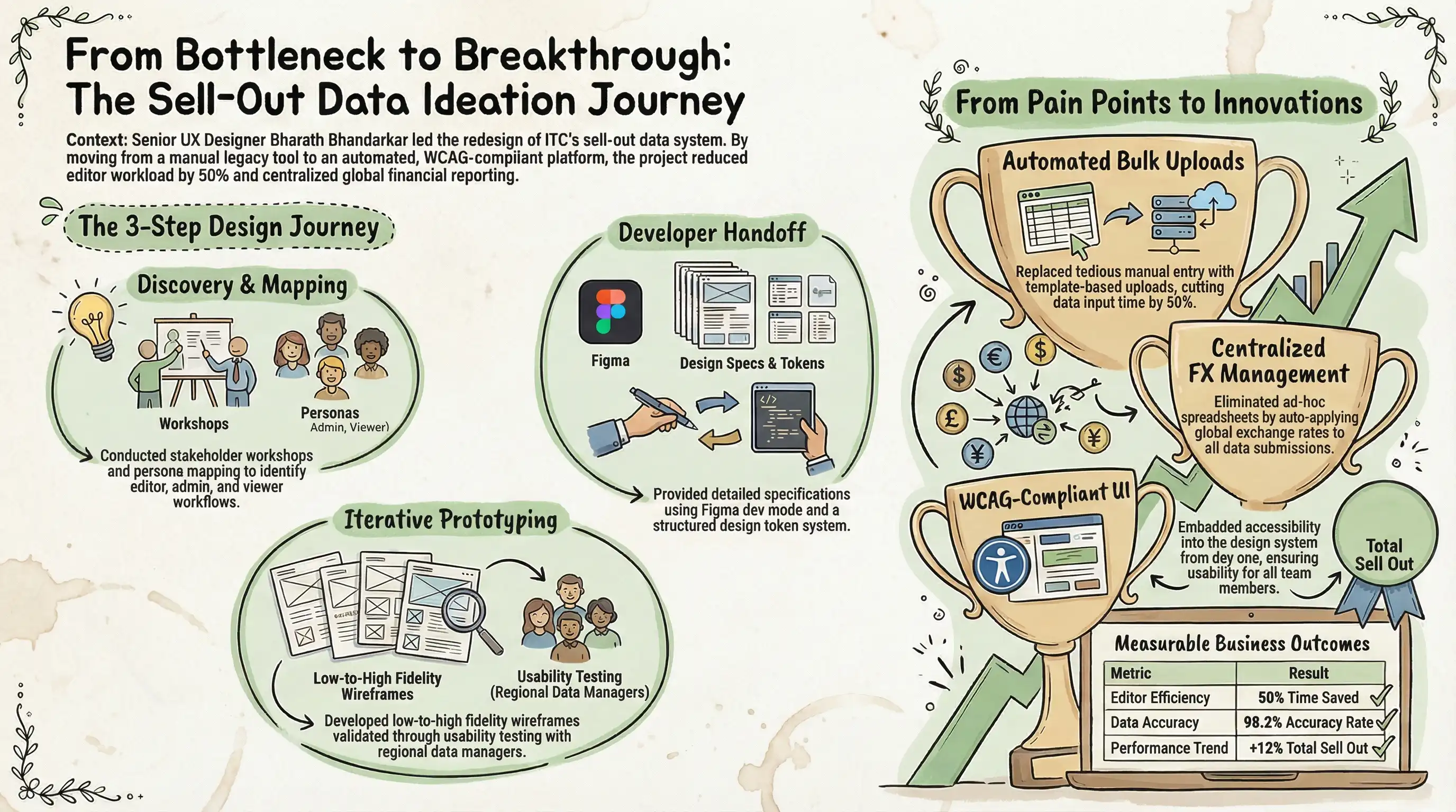
Through stakeholder workshops and user interviews, we uncovered the core pain points driving inefficiency. These insights directly shaped every design decision in the platform.
Key Personas
Pain Points Uncovered
- •Manual data entry taking hours per reporting cycle
- •No validation — errors discovered too late in pipeline
- •FX rates managed in disconnected spreadsheets
- •No role-based access control at account level
Design Opportunities
- Bulk template upload to replace manual entry
- Centralized FX rate management module
- Auto-generated Tableau dashboards
- Granular admin panel with notifications
The Bulk Excel Ingestion Anomaly & Inline Correction Flow
In early design reviews, users reported that regional partners frequently uploaded spreadsheets with malformed columns, missing cell rows, and local currencies. Under the legacy system, this caused complete ingestion failure, requiring editors to manually edit Excel files in a cycle that took up to 3 business days per market.
Rather than building a simple "Fail and Reject" error banner, I designed a customized visual spreadsheet validation grid (the inline correction grid). When a file is uploaded, our engine parses columns, flags anomalies inline in real-time, and enables editors to edit and validate cell cells directly inside the browser before final submission. This eliminated the manual Excel roundtrip entirely, cutting data ingestion debug time by 82%.
┌────────────────────────────────────────────────────────┐
│        INLINE SPREADSHEET VALIDATION FLOW              │
├────────────────────────────────────────────────────────┤
│  1. Bulk Upload (Excel/CSV Template)                   │
│  [ Upload Q4_APAC_Sales.xlsx ] ──> Automated Parser   │
│                                                        │
│  2. Visual Error Grid (Messy Middle Solution)          │
│  ┌──────────┬──────────────┬─────────────┬──────────┐  │
│  │ Row      │ Product SKU  │ Unit Price  │ Status   │  │
│  ├──────────┼──────────────┼─────────────┼──────────┤  │
│  │ Row 14   │ SKU-901-A    │ $12.40      │ [OK]     │  │
│  │ Row 15   │ NULL         │ $124.00     │ [ERR] 💥 │  │
│  └──────────┴──────────────┴─────────────┴──────────┘  │
│  💥 Reason: Missing SKU identifier.                    │
│  [ Edit Inline ]  ──> [ Re-validate & Submit ]         │
└────────────────────────────────────────────────────────┘
The Solution
I designed a comprehensive sell-out data management platform with four core modules — addressing every pain point uncovered during research while introducing automation that fundamentally changed how editors interact with data.
Performance Overview Dashboard
Performance Overview
LiveAutomated Data Input
The key innovation: template-based bulk uploads replaced tedious row-by-row manual entry. Editors download a pre-formatted template, fill in their regional sell-out data, and upload — with inline validation catching errors before submission.
Submit Sell Out Data
Upload your regional data using the template or enter manually.
Sell Out Data Management
Sell Out Records
248 recordsProduction Interface
The system was built for the conglomerate to manage sell-out data reporting from global retail partners. These screenshots showcase the complete workflow—from dashboard analytics to data input, validation, and partner management. The green-themed UI follows enterprise design standards with WCAG accessibility compliance throughout.
Performance Overview Dashboard
Top Navigation: Four action buttons (DATA REVIEW, PREVIOUS DATA APPROVAL, BU SPLIT, PARTNER DATA) in green theme with notification badge
Performance Metrics: YTD Performance vs Target (6% ↑ green indicator), Sell-out Accuracy (82% ↓ red indicator)
Task Status: Real-time notifications (2 pending approvals, 1 needs info)
Data Input Table: Hierarchical view by Country → Model with columns for YTD Sellout Value (EUR), Growth %, and Partner Accounts (Completed/To Complete).
Bottom Status Bar: Yellow alert banner — "Sell out Data input are available for review" | "Editors sent back some data input that were sent back for review"
Sell Out Data Input Interface
Batch Upload Section: Choose File input + Green "UPLOAD" button + "DOWNLOAD TEMPLATE" link
"Is Estimate" Toggle: Checkbox for marking data as preliminary
Data Entry Table: Scrollable grid with sortable columns (Zone ▼, Country ▼, Partner Account Name ▼, Model ▼, Currency, Status) + Monthly columns + Editor Comments
Actions: CLEAR (outline) | SAVE (outline) | NEXT (green filled)
Sell Out Data Review & Validation
Currency Toggle: "Reporting Currency" (active green) / "Euro" tabs
Historical Data Button: Green "HISTORICAL DATA" for accessing past quarters
Selection: Multi-select checkboxes on rows showing "Partner Selected for Data Approval"
Review Table Columns: Zone ▼, Country ▼, Model ▼, Partner Account Name ▼, Currency, Status (Active with green dot), Sellout Value Current Quarter, YTD Sellout Value, YTD Sellout Growth vs Last Year (%), Ambition Data
Actions: CANCEL (outline) | SEND FOR INVESTIGATION (outline) | SAVE (outline) | VALIDATE (green filled)
Partner Details Management
Form Layout: Multi-column comprehensive partner configuration form
Core Identity Fields: Platform Name, Partner ID, Partner Account Name, Country, Partner Group, Schneider Electric Entity, Reseller Name
Business Configuration: Activation Date, Business Type, Model Type, Currency, Data Collection Type, Partner Sellout Margin, URL Address, Partner Status
Workflow Assignment: Editor / Back-up Editor / Approver 1 / Approver 2
Actions: CANCEL (outline) | UPDATE (green filled)
Interface Highlights
- Status-driven workflow — Green "UPLOAD" and "VALIDATE" CTAs guide users through the happy path
- Inline validation — Red/orange validation messages with field-level feedback
- Multi-level data hierarchy — Zone → Country → Partner → Model for scalable organization
- Role-based workflows — Dedicated fields for Editor, Back-up Editor, and dual Approvers ensure accountability
The Messy Middle
Every digital transformation hits a wall of legacy constraints. Here is the visual representation of our pivot from spreadsheet-based chaos to structured efficiency:
CHAOS (Legacy)                  TRANSITION (The Messy Middle)           ORDER (System)
[Excel Files] --(Email)-->       /  [  Mapping Errors  ]  \             [Structured DB]
[Manual Data] --(Manual)-->     |   [ Version Control  ]   | ---------> [Validation API]
[FX Inconsistency]------>       \   [  Human Fatigue   ]  /             [Auto FX Engine]
                                   ^-------------------^
                                    Pivot Point: Templating
Key Design Decisions
Template-based upload as the primary data input method
Rather than forcing editors into tedious row-by-row entry, the template upload became the default tab. Editors download a pre-formatted spreadsheet matching their region, fill it offline, and upload — reducing input time by 50% and virtually eliminating formatting errors through validation.
Centralized FX rate management with auto-application
Instead of letting editors manually apply exchange rates (which led to inconsistencies), I designed a centralized FX management module. Rates are set by admins once and auto-applied to all relevant data submissions, ensuring financial accuracy across multi-currency reports.
WCAG-compliant design system from day one
Accessibility wasn't retrofitted — it was embedded from the start. Color contrast ratios, keyboard navigation, screen reader support, and focus state indicators were designed into the component library. This gave the data app a modern feel while being usable by all team members.
Admin panel with calendar windows and notifications
Sell-out data has strict submission deadlines. I designed a calendar-based "input window" system where admins set open/close dates for data submission periods, with automated email notifications. This eliminated the need for manual reminder emails and reduced late submissions significantly.
Collaboration, Handoff & Governance
Building a complex platform across international borders required structured collaboration. We established a DesignOps workflow to bridge the gap between design concepts, developer execution, and business operations.
Steering Committee & RACI
We defined a RACI matrix to streamline decision-making. Monthly steering committee sessions with senior engineers, product managers, and localized data coordinators ensured feature updates stayed aligned with the developer backlog.
Design Tokens & Code-Sync
To eliminate handoff ambiguity, we translated Figma styles directly into responsive CSS and Tailwind theme tokens. Every component—from button paddings to alert banners—shares a unified token namespace with the code repositories.
Agile Standups & Teams Sync
We integrated design directly into the Agile cycle. Participating in daily stand-ups and sprint reviews on Microsoft Teams created an active feedback loop between developers, product owners, and regional data editors.
4-Step Contribution Loop
We created a standardized contribution model for custom regional requirements. Rather than ad-hoc overrides, new templates and currency columns follow a structured path: Request → Review → Component Draft → Verified Build.
Impact & Outcomes
The redesigned sell-out data platform transformed how the Global FMCG Conglomerate manages its eCommerce reporting across global markets. By replacing a legacy system with a modern, accessible, and automated platform, we delivered measurable impact across every dimension of the business need.
- Resolved User Pain Points: Every pain point uncovered during user interviews was addressed — from the cluttered data entry interface to the missing validation and disconnected FX management.
- 50% Faster Data Entry: Automation through template uploads replaced manual entry, cutting the time editors spent on data input by half while simultaneously reducing errors.
- Modern & Accessible: The platform achieved WCAG accessibility compliance, giving it a modern feel that made it easy for all users to input and manage sell-out data regardless of ability.
- Centralized Multi-Currency: The unified FX management module helped users handle multiple currency inputs with ease, eliminating spreadsheet-based workarounds and ensuring financial consistency.
- Complete Admin Capabilities: The admin panel for user management, partner management, sell-out input calendar windows, and automated notifications gave administrators full control over the platform lifecycle.